Design Showcase
Mayflower Button
Government Design System Conversion
Team Project
Mayflower DS Team
My Responsibility
Convert Button Components in Figma
Tools
Figma
Google Chrome
Overview
Mayflower is a design system used by the Massachusetts government to create consistent and user-friendly digital experiences across state agencies. Building a Mayflower Figma library helps agencies make realistic mockups quickly without starting from scratch, reducing costly changes during development and saving taxpayer money.
For this project, my role was to build a Figma button library to help state agencies easily find and use various button styles when updating or drafting new web pages.


The Mayflower Design System is widely used by various government agencies.
Problem Statement
State government websites use a wide variety of buttons, which makes organizing them in a Figma library challenging. To prevent the component library from becoming too large and difficult to use, I had to rethink how the buttons were categorized. Additionally, the differences between Figma components and website widgets added complexity to the process.

Goal
Create a Figma button library that follows the Mayflower style guide, making it user-friendly for designers and adaptable to different needs.
Design Process
1. Research
Audit current buttons usage
Document buttons’ attributes
2. Standardizing Button Properties
Align button attributes with Figma component properties
Standardize or merge applicable properties
3. Design
Convert consolidated properties into Figma's settings
Build a framework for efficiently managing button variants
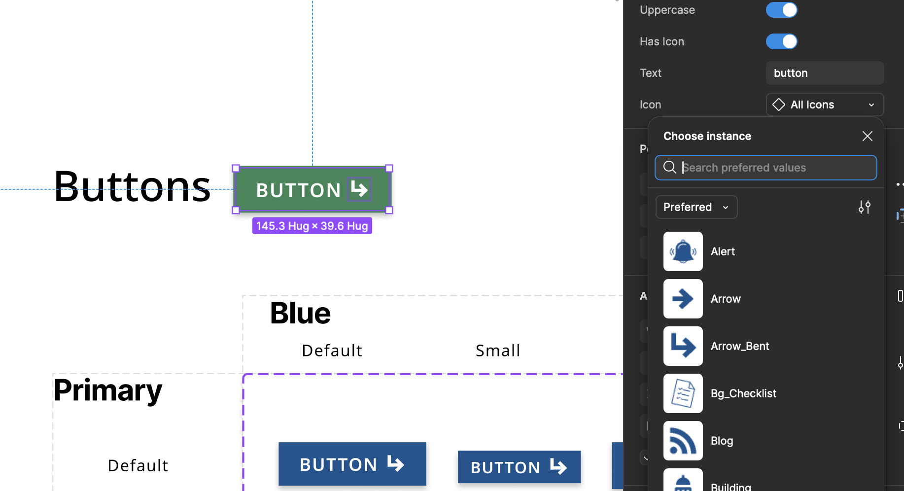
When I started the task, I created Figma components for each button and named them using the format “attribute A+attribute B+attribute C+...”. However, as the library grew, I realized this method couldn’t account for all attribute combinations. Buttons often share overlapping attributes and include various icons, and using long, complex component names would make it harder for users to efficiently find the buttons they need.

Research
To ensure the Figma button component encompassed all buttons in the Mayflower design system, I collaborated with the team’s senior designer. After identifying the attributes the Figma button library needed to support, I compared buttons’ attributes with the properties of Figma components.
I determined that attributes such as Usage, Theme/Color, Size, State, Icon, and Text Content could be directly converted into component variants. However, attributes like Underline, Border, and Capitalization required integration into other Figma properties or configuration through alternative methods.

Figma Button Properties
Without access to the original button layout data, I used the browser's inspect tool to gather button details, making sure the Figma components match their real-world use.

I aimed to reduce the number of buttons by adding variants, letting users switch between options through the control panel.

Since the properties of each variant in a component also apply to the entire component and influence other variants, I had to duplicate certain variants and assign them different property sets. To manage this efficiently, I implemented a two-dimensional property framework, which allowed me to target specific variants with all possible property combinations while minimizing unnecessary duplication.

Button Component Test
How to optimize icon switching in button component?
By adding variants, I consolidated the button library into a single component, making it easier for designers to select buttons. However, I encountered a challenge when designing a button component with an icon: to enable users to switch icons through the control panel, a separate component must be created for each icon in the library, which increases the total number of components. Alternatively, integrating all icons as variants into one component would require users to double-click the icon area of the button to switch icons, adding an extra step to their workflow. If you have any suggestions for addressing this issue, feel free to reach out—I’d love to discuss it!